Beat Saber as Exercise, 2020
Motivation and Goal
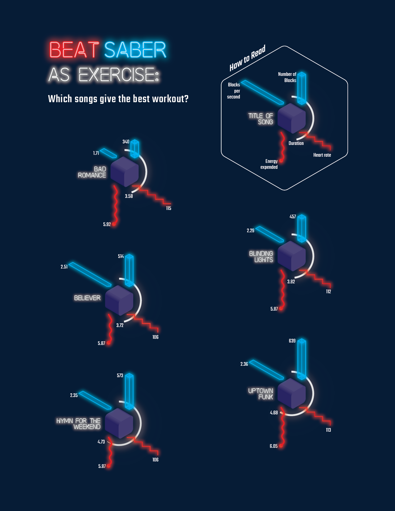
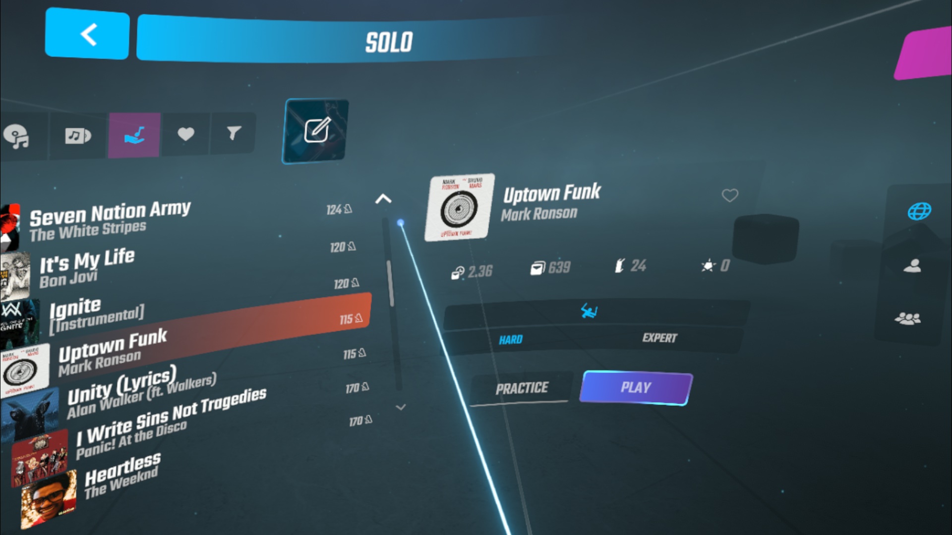
This week, I collected data from Beat Saber, a VR game that gets you to cut blocks to the beat, using light sabers. Having just started playing a week ago, I could feel it taking my breath away, literally. Much has been touted of the game’s potential to burn calories, and I wanted to see just how much exercise it could offer, especially since going out often is not a preferable option.
Process of Data Collection
For this, other than the VR equipment required to play the game, I also put on my Apple Watch to read my body’s response to the exertion.
I selected five songs at random from my custom songs list, which provides some data about songs, the number of blocks per level, and the average number of blocks per second. I played each song twice to average out the data collected from the Watch. I retrieved the data from the Health app.

First iteration - Class presentation
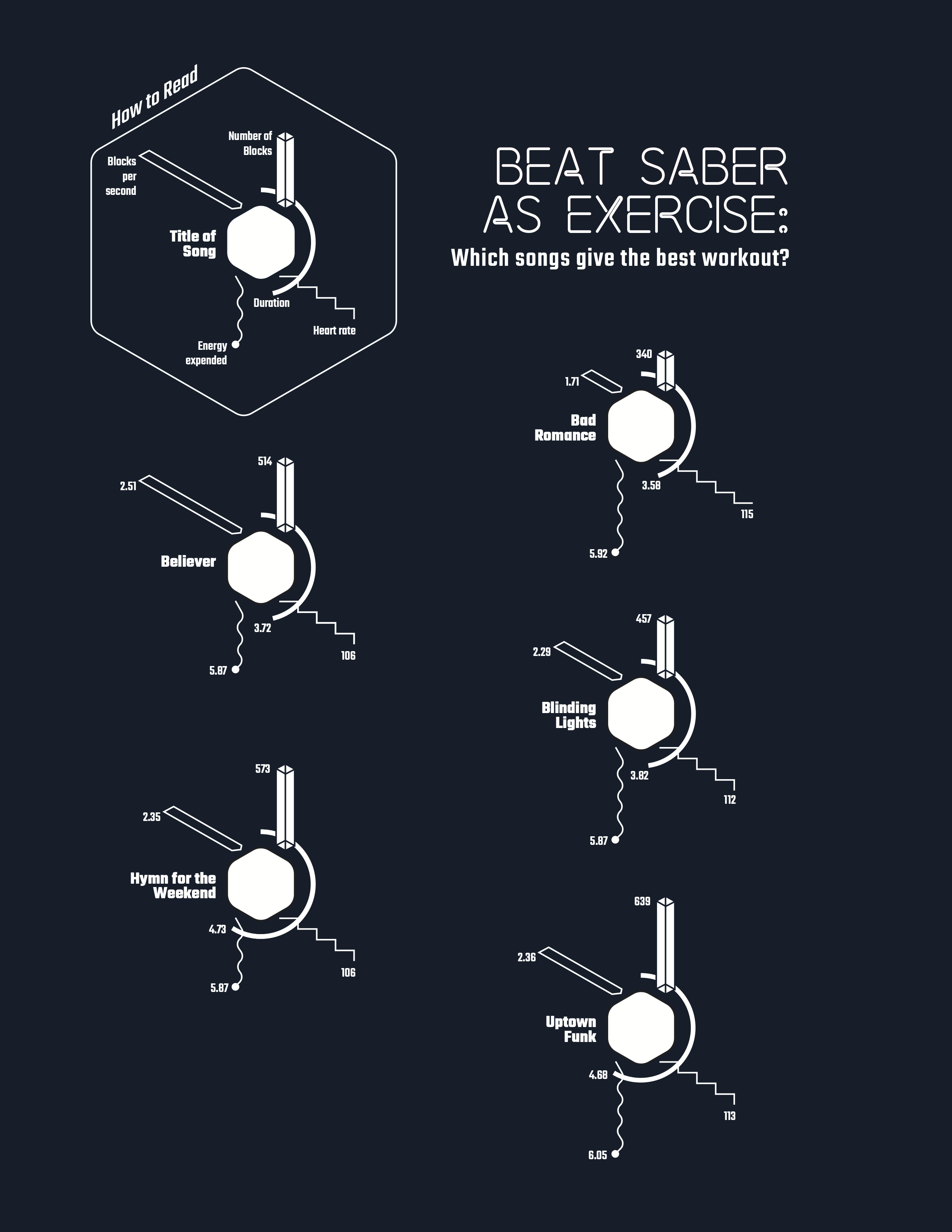
I was inspired (again) by Accurat’s visualization style, this time their work with badges, for example like this one about brain drain. I wanted to represent this data meaningfully in the same vein with a minimalist graphic style.
To center the data of each song, I wanted to represent the 3D view of the blocks, a central visual in the game; in this case, I wanted to show in 3D, isometric view, but the lines did not make it look realistic.
I also wanted to separate the data derived from the game (song data) and those of my vitals, hence placing the song data on the top half of the hexagon, and my data on the lower half of the polygon.
I also decided that the song duration would be a relevant metric, so I represented it as a circular bar chart.
I used various minimalist shapes and lines to attempt to represent the values, and trying to make them distinct. For the speed (blocks per second), I added an arrow to the bar. For the number of blocks, I used a vertical bar chart. My heart rate i represented as sharp zig zag lines, and for energy expenditure a rounded wave drop which reminded me of quantum energy drops, for some reason.
Final iteration
While I was somewhat satisfied with the somewhat 3D nature of my first iteration, I did not like the aesthetics. It did not remind me much of Beat Saber, the fonts alone could not bring the association. I played around to get a neon effect, and applied it generously to the visualization elements. I also used Illustrator to extrude crude rounded blocks.Shuffling some elements around, I have a more interesting final iteration.
While I was somewhat satisfied with the somewhat 3D nature of my first iteration, I did not like the aesthetics. It did not remind me much of Beat Saber, the fonts alone could not bring the association. I played around to get a neon effect, and applied it generously to the visualization elements. I also used Illustrator to extrude crude rounded blocks.Shuffling some elements around, I have a more interesting final iteration.