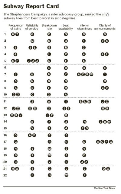
Subway report card, 2020
First impressions
This is a minimalistic execution, in terms of colors (black with white background), shapes (circles in the train line identifiers, and lines to help with locating ranks in increments of 5). It is easy to read for the sole purpose of ranking, but is however excruciatingly difficult to search for a particular line to see all its rankings, or look at groups of lines (1,2,3 for example, which covers much of the same area).
Context and Purpose
The above graphic appeared in The New York Times, depicting data from an advocacy group. It is hard to understand what the goal of the graphic is. If it were to raise awareness of the conditions in the Subway, it is difficult to understand when no discernible metrics are given, and that the rankings are relative in nature.
If it were to provide information for people to petition for better conditions, what criteria would warrant action? Would their action target specific lines only? How would they locate the necessary collated information to begin?
If it were to inform MTA to improve certain aspects of the service, which lines serve as exemplars? Or could they be all of unacceptable standard, but ranked accordingly?
First Iteration and Use cases
In my first iteration, I designed a bump chart with the average commuter in mind, to search for lines they may use frequently. To aid in this search, I colored the lines as seen in wayfinding on the subway, and I grouped similar colored lines together. I duplicated the grouped lines and rankings to the right.
On hindsight, the lines which were intended to link train lines together got very confusing very quickly. I felt that the identifying train line colors alone would be sufficient and speed up information search. I had doubts about my prioritization of the information, and sought out other people’s solutions and rationale, which I found on an old post on Junk Charts.

Second Iteration and Use Cases
In my second iteration, I learnt from the Car assignment. Using the original rank groupings, I split the rankings into 5 categories, and prioritized the train lines at the top of the table, and the criteria on the left.
The aim was to be able to locate train line report card information quickly, and to compare across similar train lines.
